An Impressive Multigenerational Home That Blurs Indoor + Outdoor Living
Perhaps the most striking element of this 600sqm home, is how it expands after you’ve entered through the front door. Its design is deceptive, as from the street, the structure’s breath-taking size and connection to the garden is totally hidden. This was, of course, the aim of architect Micheal Ong from MODO, who designed the house as a progression of spaces and moments to ensure it never presented as overwhelmingly large.
An Impressive Multigenerational Home That Blurs Indoor + Outdoor Living
Architecture

The courtyard leads through to the maple tree in the centre of the property. Photo – Derek Swalwell.
The landscape design was completed by Bush Projects. Photo – Derek Swalwell.
The build was completed by Visioneer Builders. Photo – Derek Swalwell.
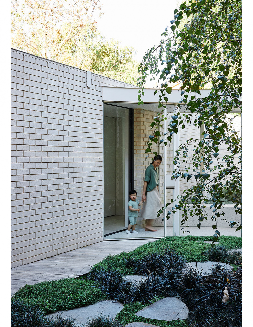
White concrete brick features on the the lower level rooms. Photo – Derek Swalwell.
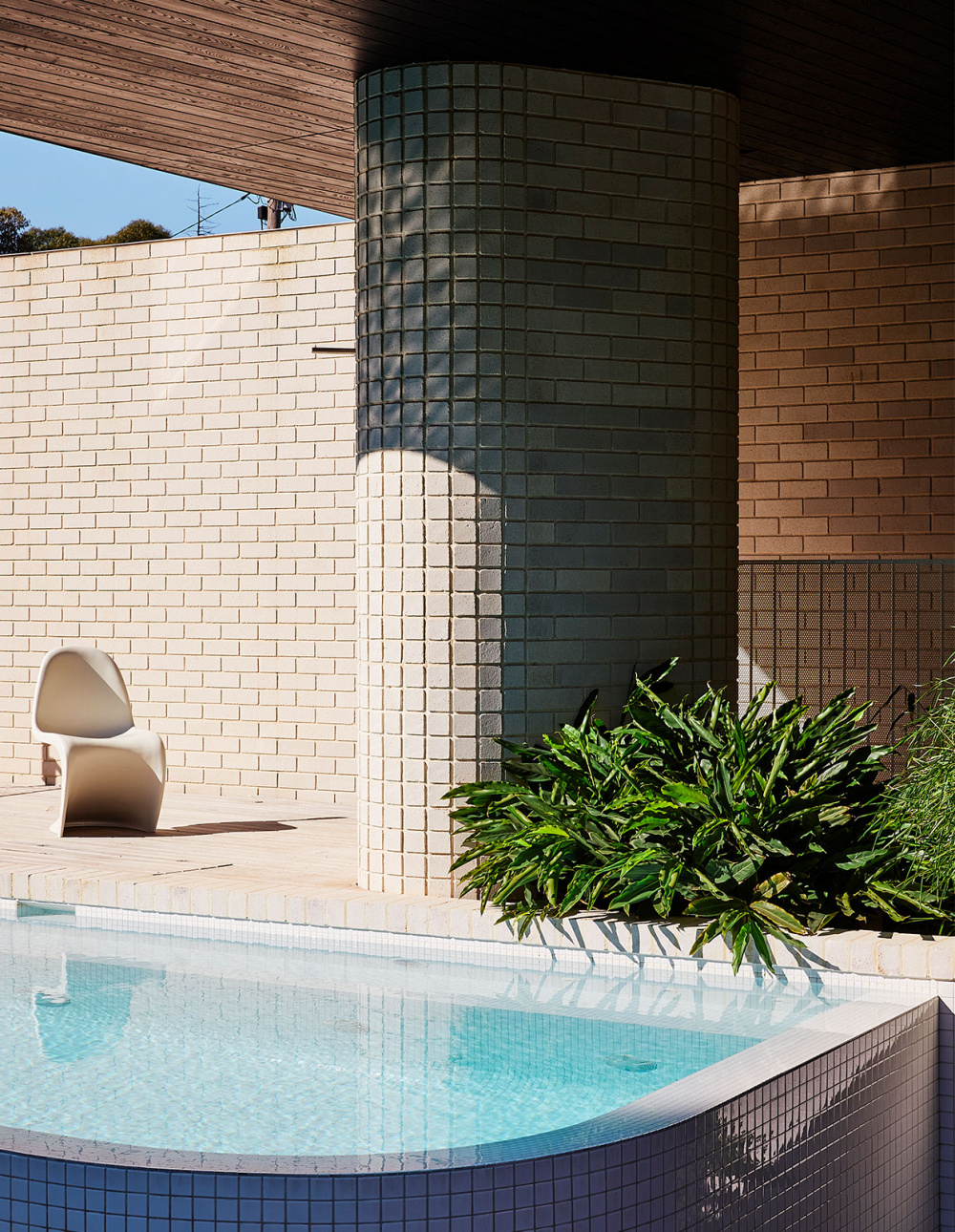
Michael Ong utilised curves in the design to soften the expansive size of the home. Photo – Derek Swalwell.
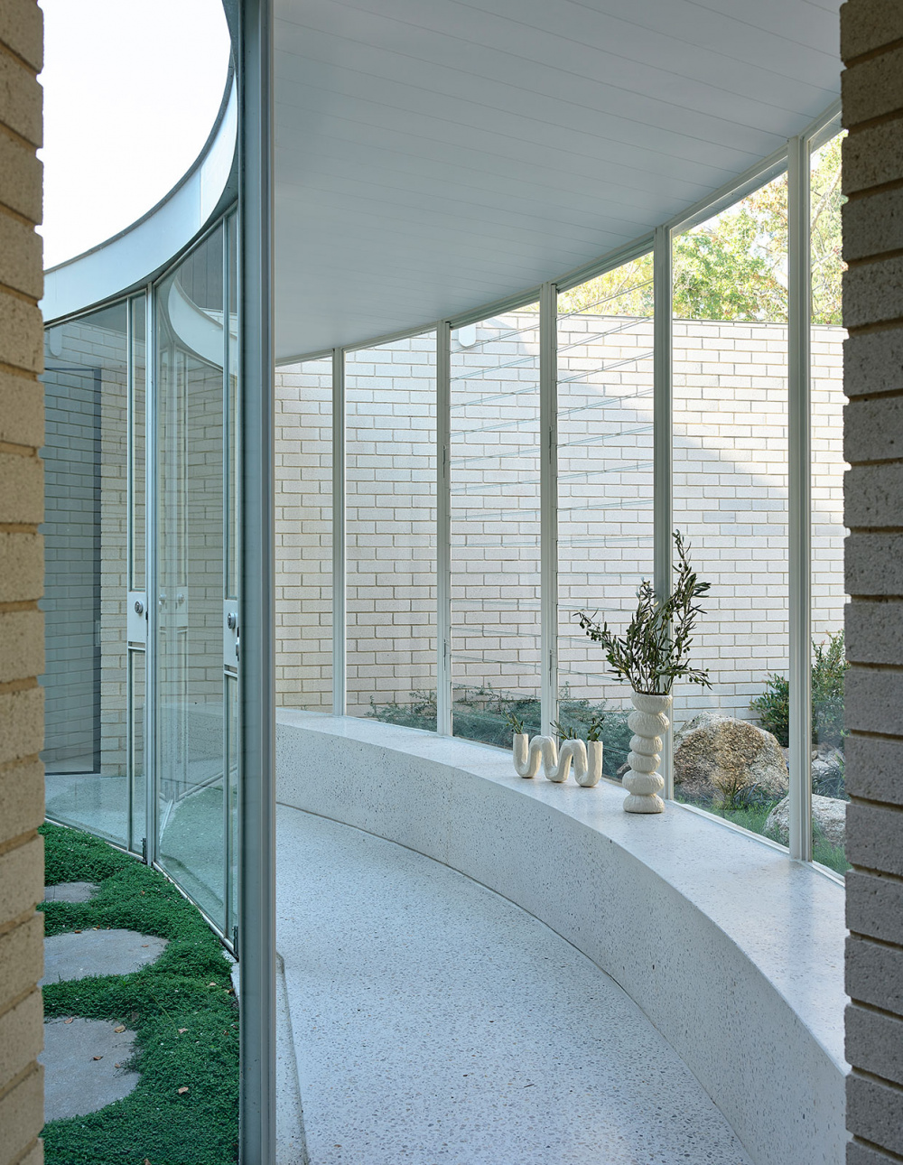
“The linking curved glass corridor doubles as a sunroom for cooler days,” says Michael. “A curved, in-situ bench encourages you to slow down.” Photo – Derek Swalwell.
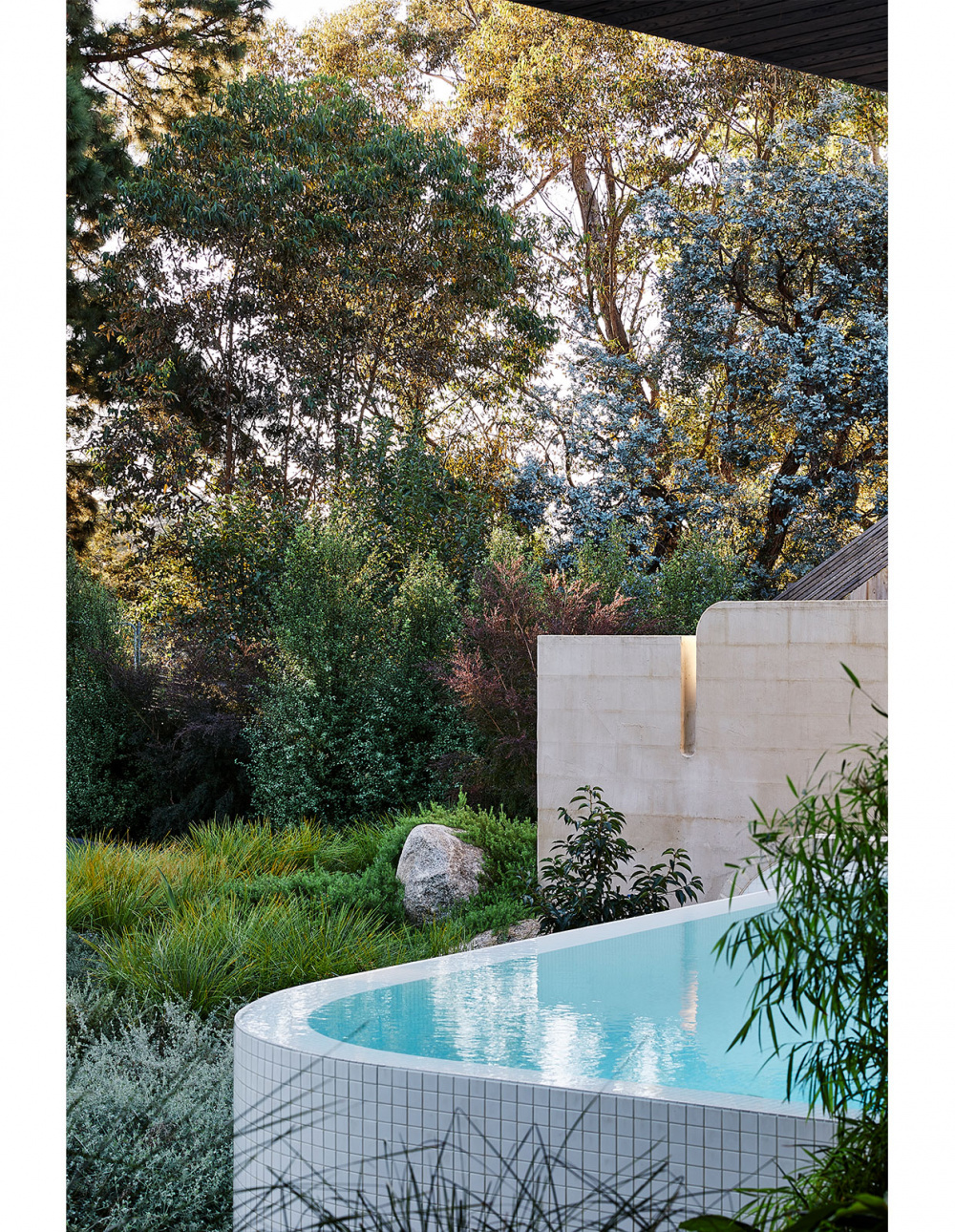
Michael describes wanting the house to belong to the landscape. Photo – Derek Swalwell.
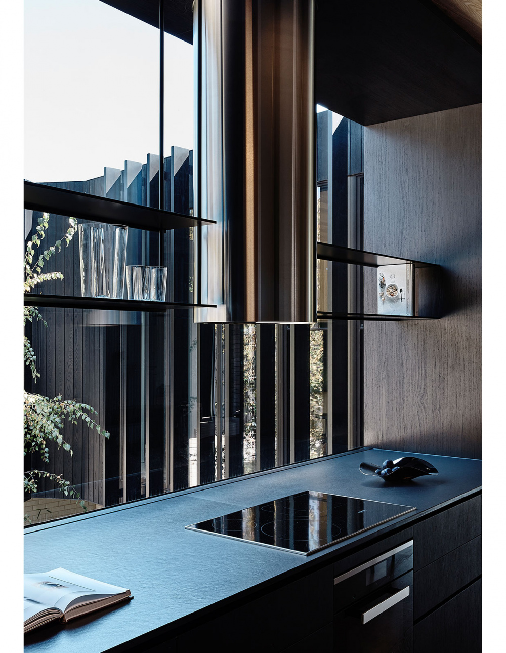
Every room in the house has a connection to the outdoors – even the kitchen. Styling – Jess Kneebone. Photo – Derek Swalwell.
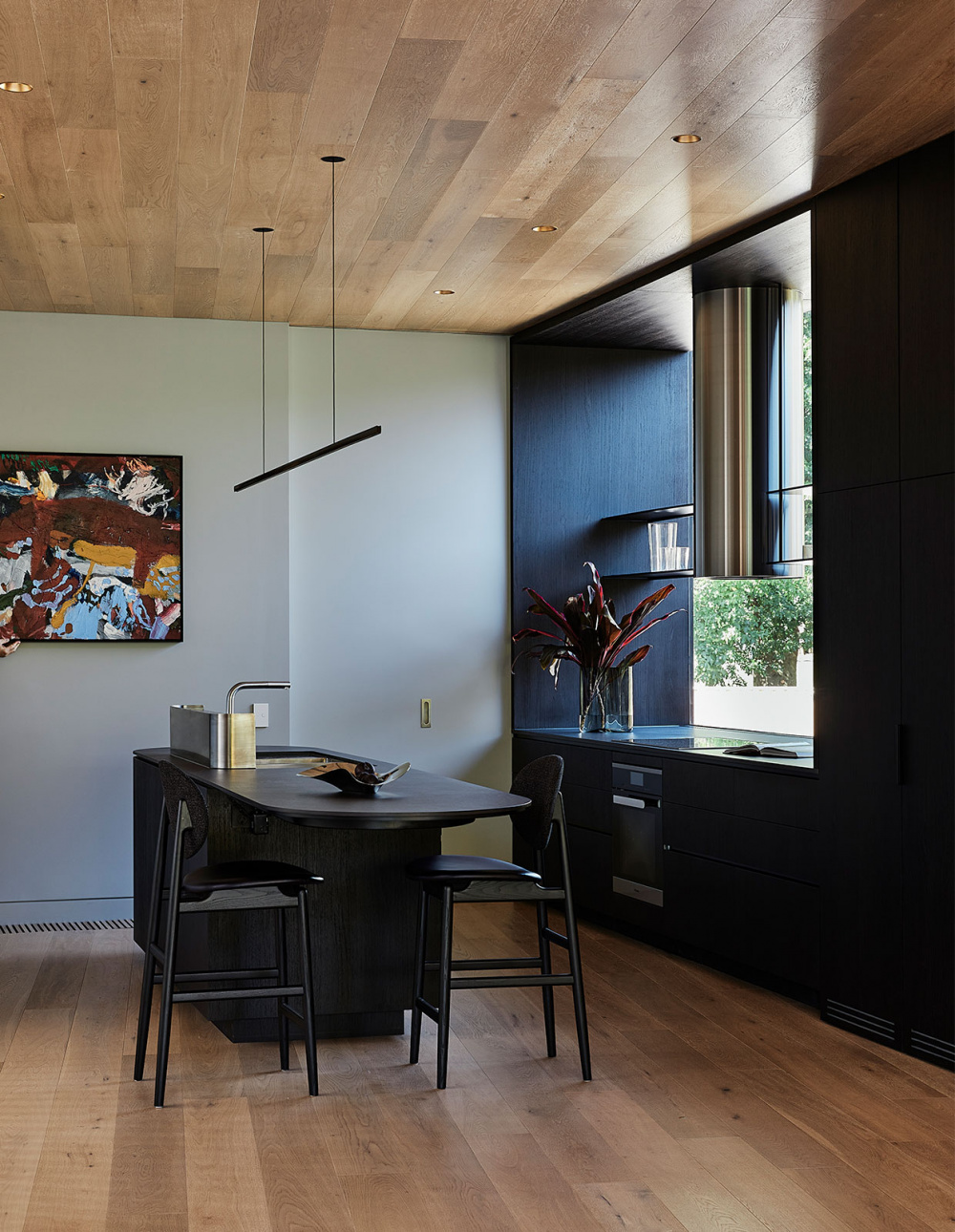
The kitchen mirrors the rest of the house in its dedication to simplicity and form. Styling – Jess Kneebone. Photo – Derek Swalwell.
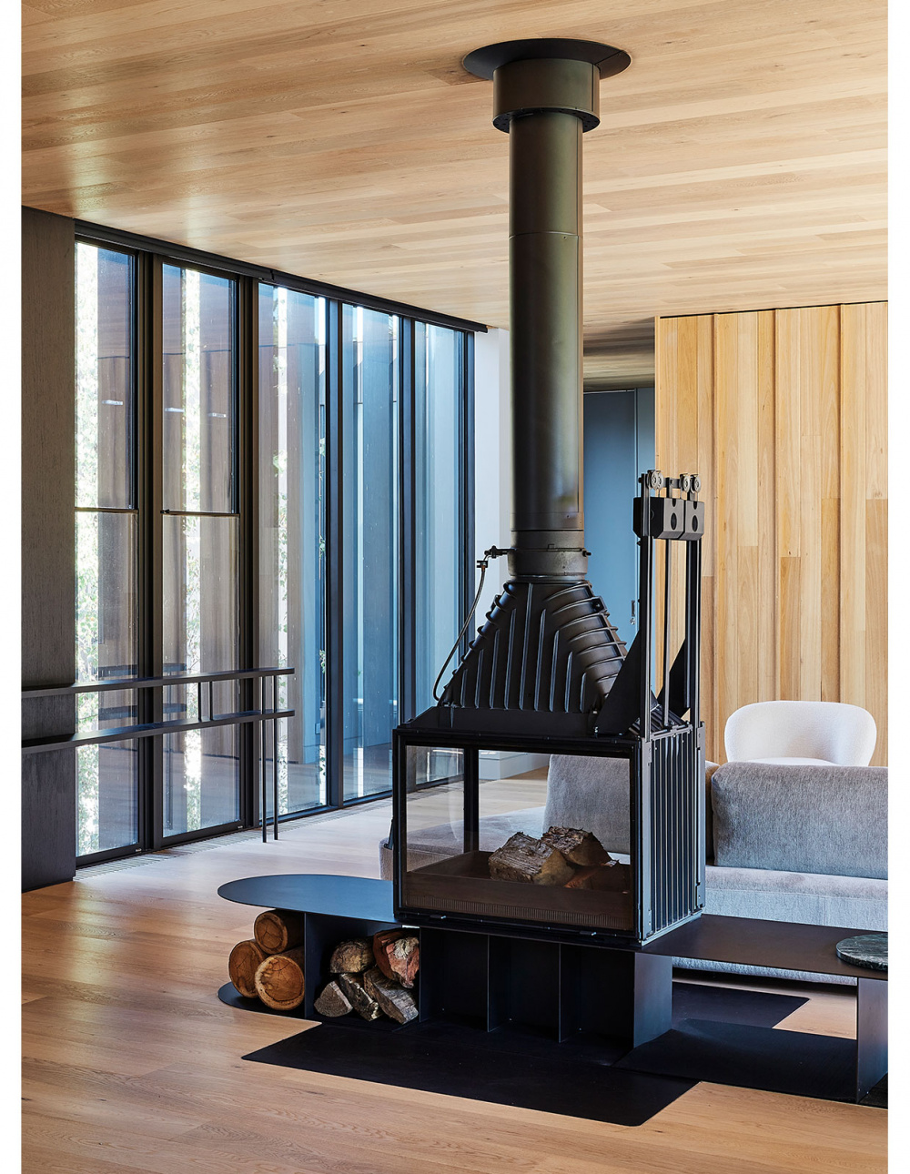
Even the interior fireplace has an element of transparency, to connect the living spaces. Styling – Jess Kneebone. Photo – Derek Swalwell.
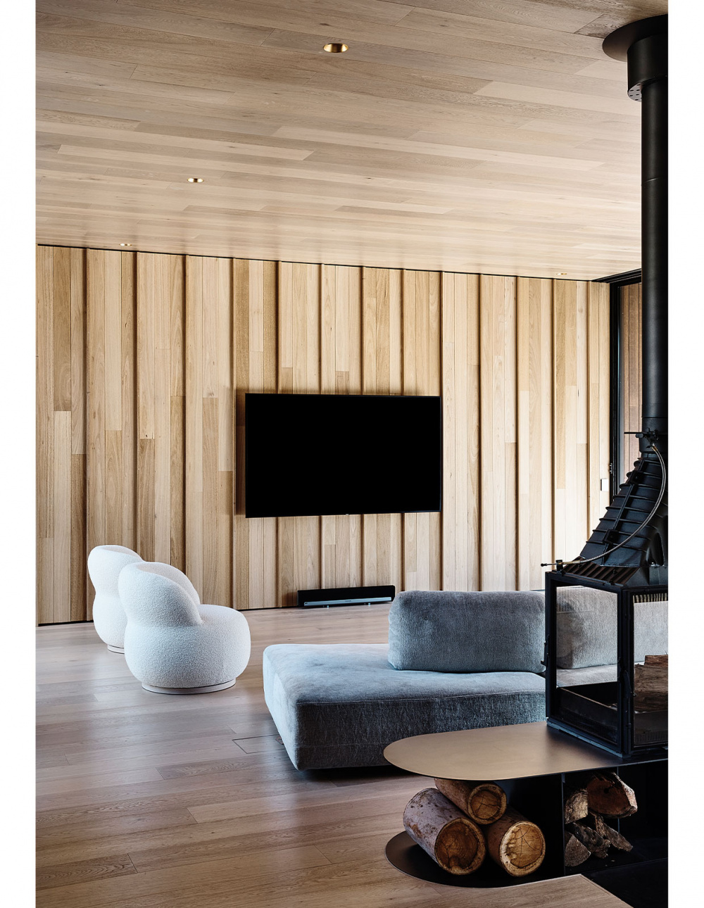
Inside, the furniture choices reflect the curves and forms of the building. Styling – Jess Kneebone. Photo – Derek Swalwell.
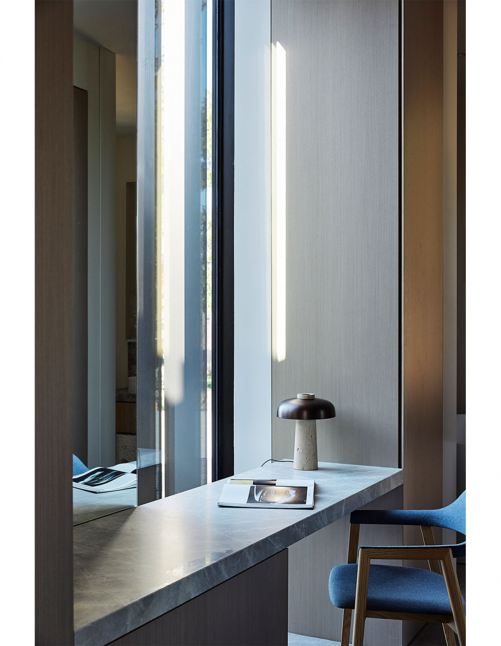
An office nook, with a view out onto the garden. Styling – Jess Kneebone. Photo – Derek Swalwell.
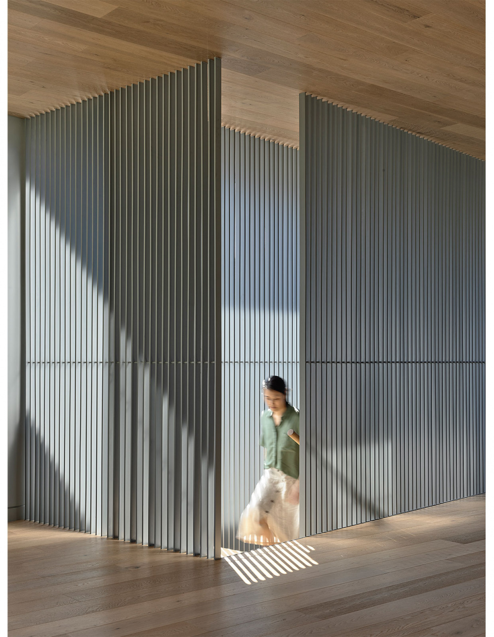
“By retraining the amount of materials used, we allowed the forms and ideas of the house to be clearly expressed,” says Michael. Photo – Derek Swalwell.

The upper rooms are dedicated to living spaces. Photo – Derek Swalwell.
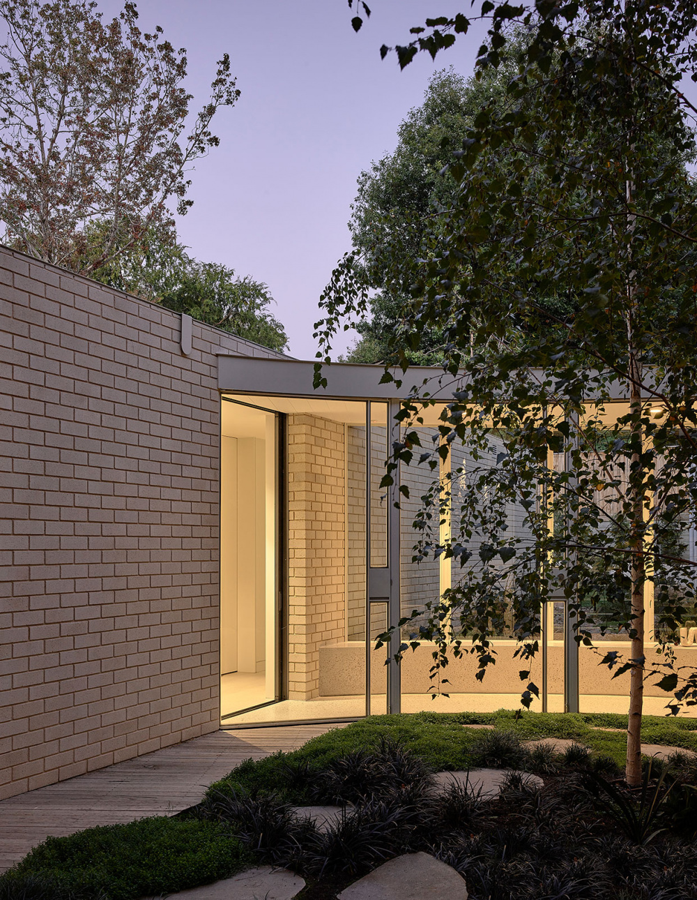
Photo – Derek Swalwell.
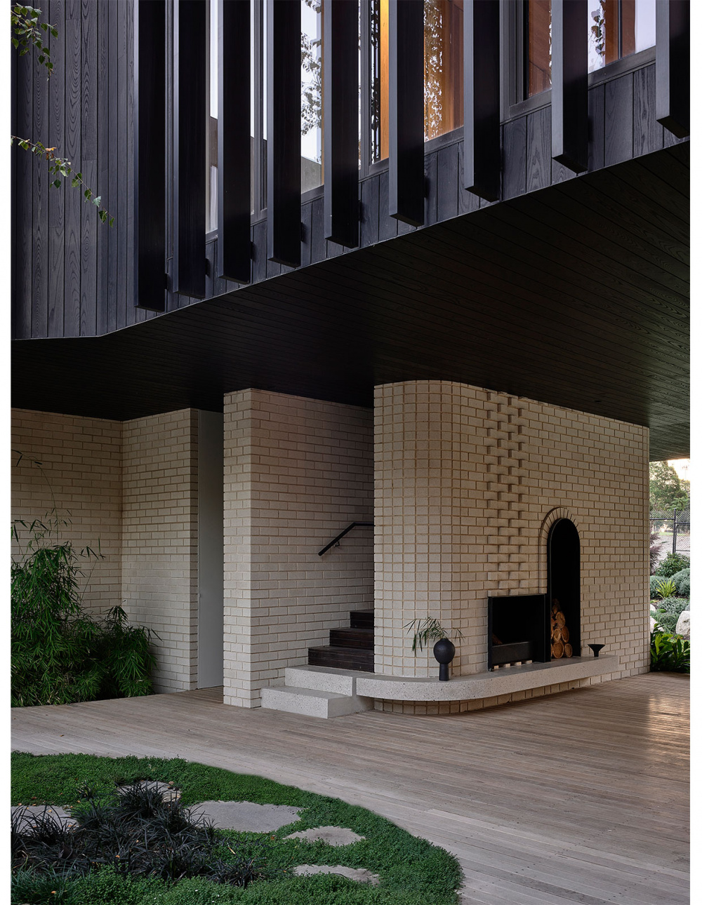
“The composition of this house appears both natural and sculptural, and one that invokes a sense of wonder and curiosity.” Photo – Derek Swalwell.

Photo – Derek Swalwell.
When met with the challenge of designing a multi-generational Mount Waverly home that could accommodate the owners (a retired couple), their young adult children, and visiting family or friends for prolonged stays, architect Michael Ong from MODO knew the answer lay within one spacious design – even though his clients were convinced it could only be achieved through separate dwellings.
‘We were able to illustrate another possibility by creating flexible spaces and ‘breaks’ between private spaces with courtyards, glazed corridor links and material changes,’ says Michael.
Instead of the traditional distinction between house, front yard and backyard, Michael and his team were able to weave the garden through the home, to create a house that is embedded in the landscape and surrounding environment.
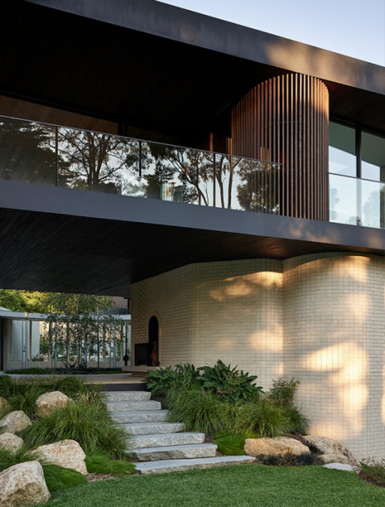
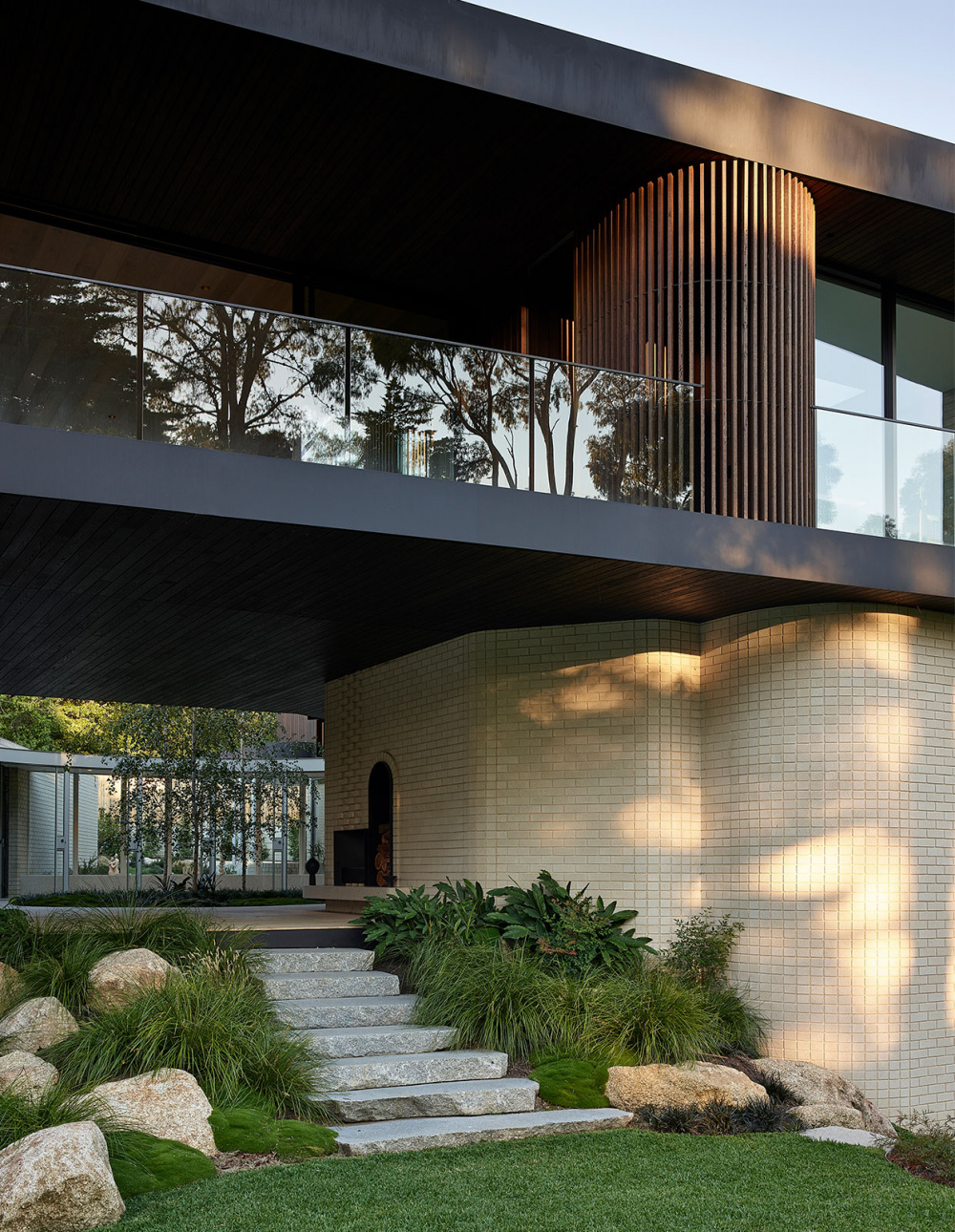
The sun-filled interior courtyard separates the two linear wings on the ground floor, which are connected by a sweeping, glass corridor. Sitting above the brick is the second floor, wrapped in dark timber, which holds the main living spaces.
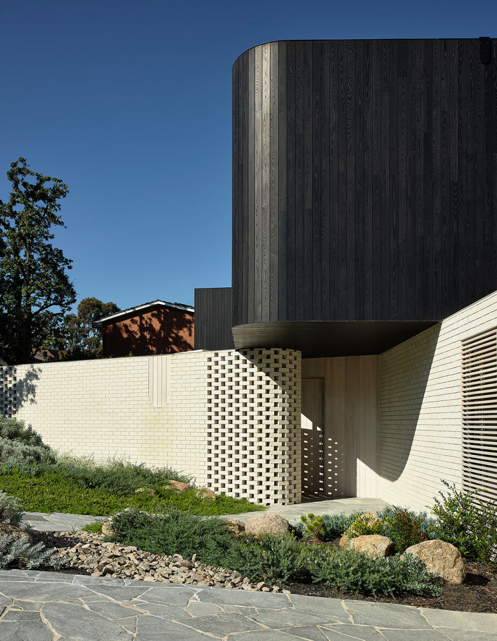
‘The home is primarily made up of these two materials and forms,’ explains Michael. ‘On the lower level, the house is wrapped in a warm white concrete brick, while the floor above is cladded in a black stained and thermally modified timber. The brick roots the house to the landscape and provides the perfect canvas for shadows from the garden.’
Despite the size of the house – a spacious 600sqm – the design ensures it never feels overwhelmingly large, but instead ‘acts more like a progression of spaces and moments,’ explains Michael.
Connection to the outdoors was crucial for this design ambition to be realised. ‘As you move through the house, you are constantly looking into the main courtyard space, and eventually it naturally becomes a shared backdrop for everyone,” says Michael. “Both as a way to create constant connection with the landscape and as a visual anchor throughout the home.’
The way in which the property interacts with the garden and neighborhood was also a significant factor in the finished design, which feels natural and rooted into the land, ‘like a rock half submerged,’ says Michael.
Firstly, from the street, Michael knew that introducing a visually different house needed to respect the surrounding scale. So, by following the contours of the land, Michael ensured the profile of the house sat as one of the lowest on the street. ‘From the top of the street, you can actually see over this house completely,’ he says. ‘The setback is generous and we move the majority of the first floor form away from thes treet to minimise the visual bulk.’
Secondly, he employed the use of curves to give the considerable form a softer, more sculptural look. Windows and doors, too, are positioned away or are in fact totally hidden from the street to remove a sense of scale and architectural elements. ‘This emphasises the form as a sculpture, rather than house,’ says Michael.
The final design encourages connection with shared spaces including the courtyard, fireplace and pool central to the design, but also allows for separation, with pockets of space for contemplation and quiet.


