A California Bungalow That Embraces Its Garden
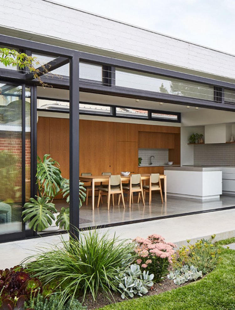
Maike Design are a Melbourne design studio who’ve gained a reputation for their clever approach to heritage home renovations, creating bright and functional spaces completely tailored to each individual site. Their latest project, Garden House, showcases this very approach, comprising a sympathetic renovation of a brick California bungalow, alongside a new north-facing pavilion. The original house has been reworked to create calm and enclosed private spaces, while the pavilion is as much a part of the garden as it is the house.
A California Bungalow That Embraces Its Garden
Interiors
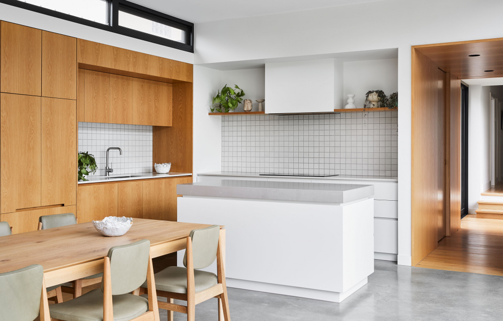
Garden House is a bright and functional transformation of a previously dark and inward facing brick bungalow in Malvern East, Victoria. Various ceramics from Modern Times. Photo – Tess Kelly. Styling – Beck Simon
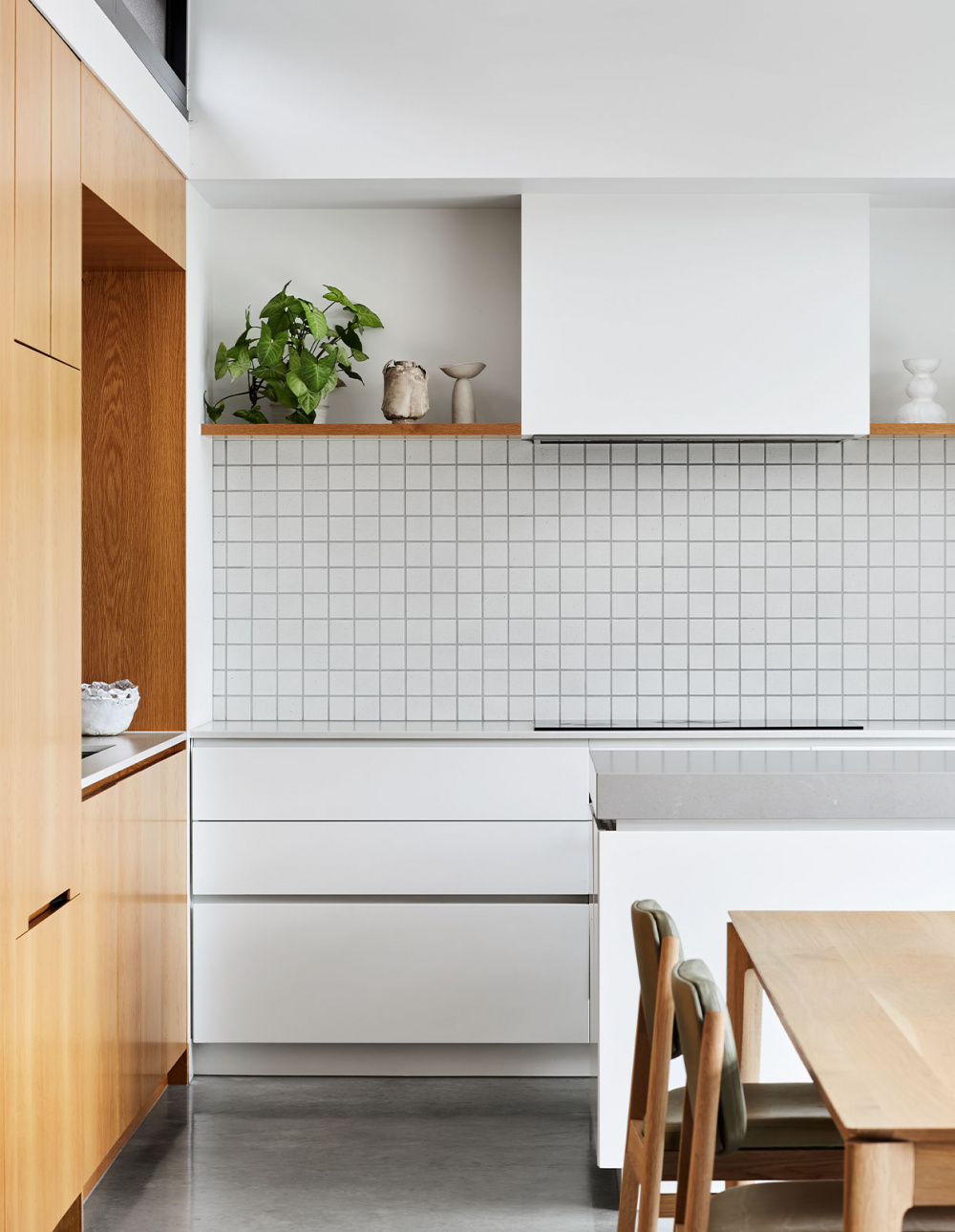
Various ceramics from Modern Times. Photo – Tess Kelly. Styling – Beck Simon
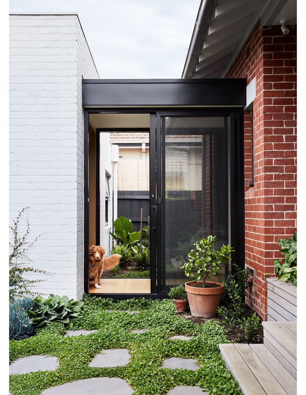
Among Mairead’s favourite elements of the project is the glass walkway – the single point where these two structures meet. Garden design by Amanda Oliver Gardens. Photo – Tess Kelly. Styling – Beck Simon
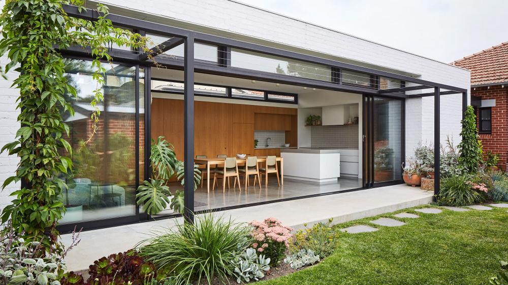
The adjoining extension turns 90 degrees to the original house towards the northern sunlight. Photo – Tess Kelly. Styling – Beck Simon
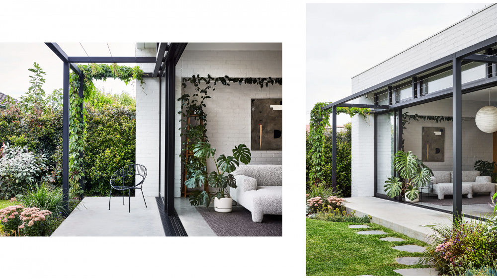
Spaces are lined up along the length of a nine-metre long glazed wall, directly connecting each room to the garden. Artwork by Saxon Quinn from Modern Times. Photos – Tess Kelly. Styling – Beck Simon
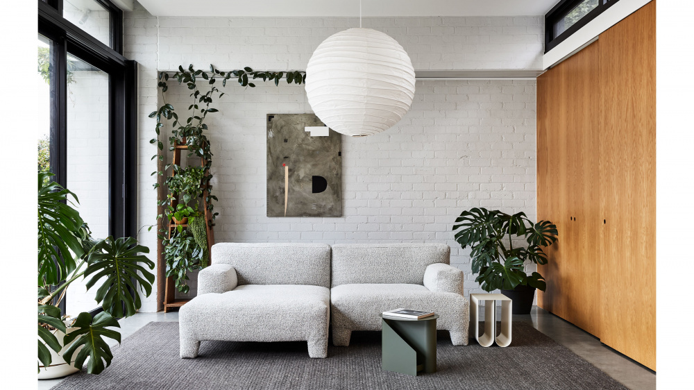
Artwork by Saxon Quinn from Modern Times. Photo – Tess Kelly. Styling – Beck Simon
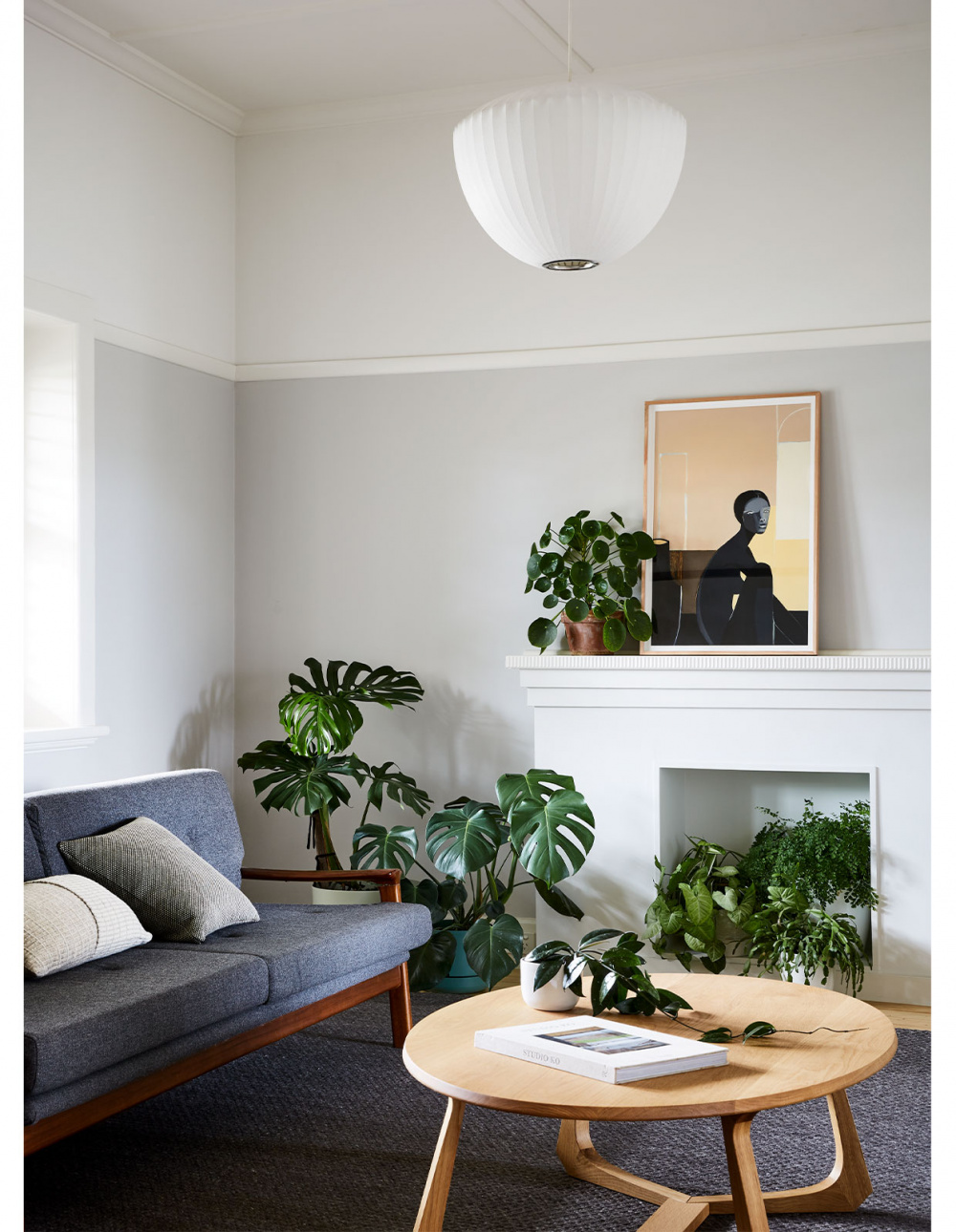
Maike Design replanned the existing house to feature quiet spaces catering to the ‘inwards facing parts of life’. Artwork by Stacey Rees via Modern Times. Photo – Tess Kelly. Styling – Beck Simon
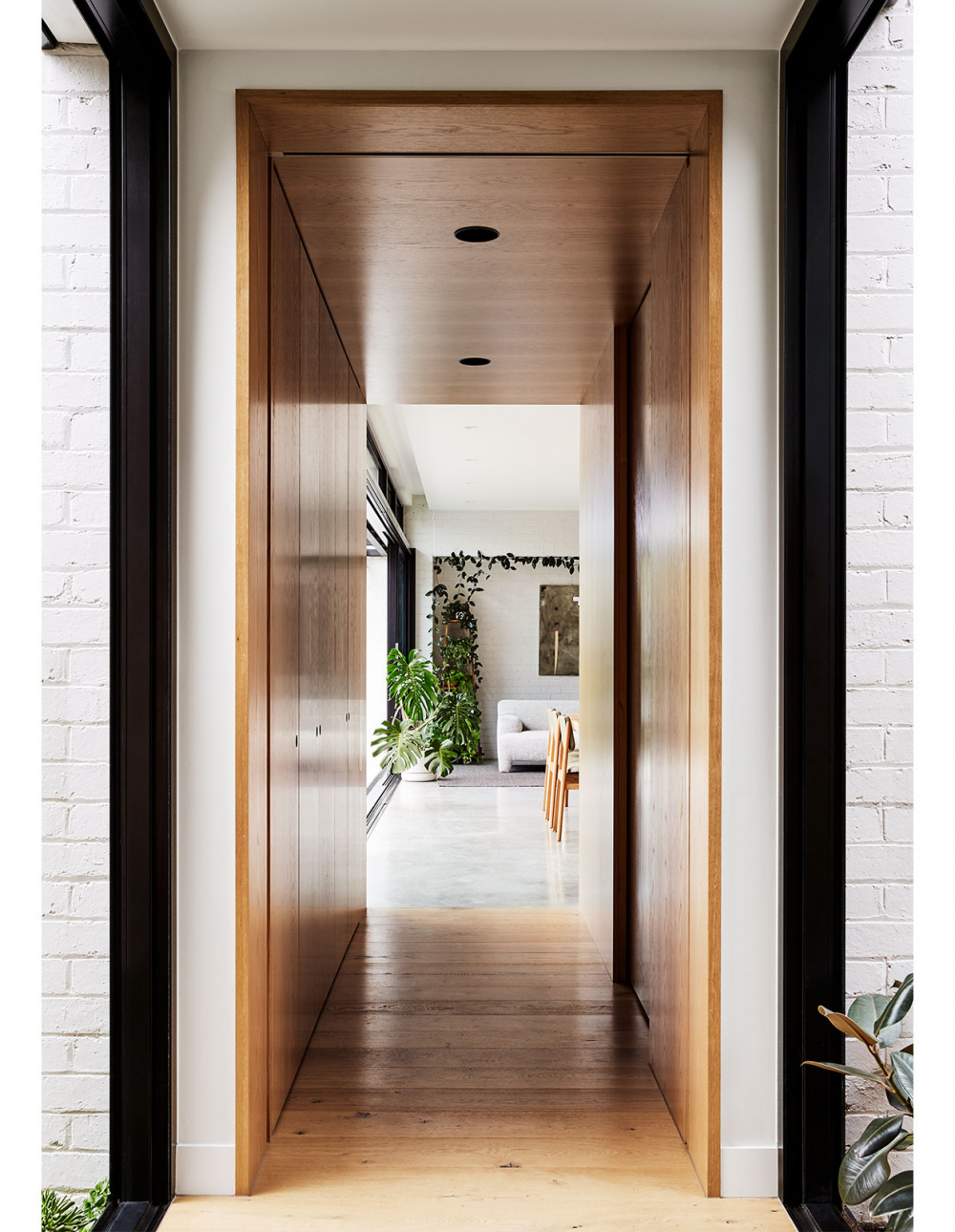
Where old meets new. Photo – Tess Kelly. Styling – Beck Simon
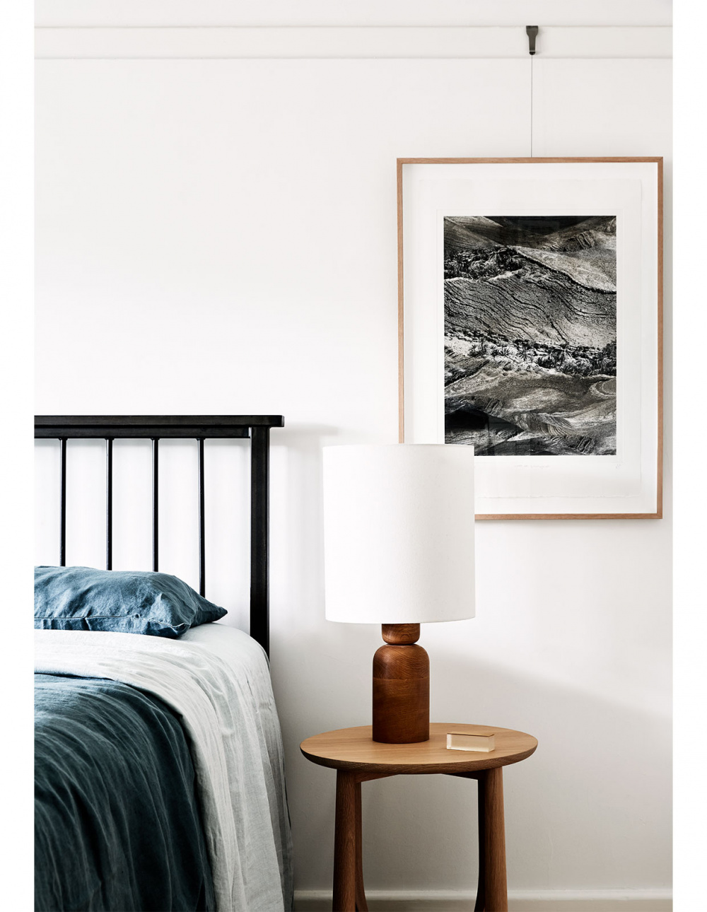
Artwork by Jennifer Tarry-Smith via Modern Times. Photo – Tess Kelly. Styling – Beck Simon
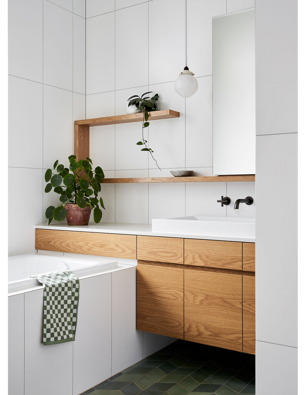
The overall project has allowed for the existing house to be largely retained, while creating space for new rituals and moments of delight. Photo – Tess Kelly. Styling – Beck Simon
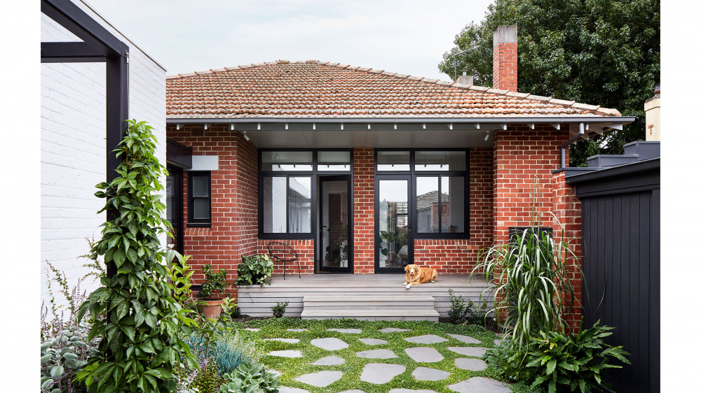
The most significant update was the opening of the original house rear to the garden. Photo – Tess Kelly. Styling – Beck Simon
Garden House is a bright and breezy transformation of a previously dark and inward facing brick bungalow in Malvern East, Victoria, by Maike Design, and overseen by Bancroft and Malone Architects.
The brief provided was to accommodate the growing family’s needs, including the provision of spaces for working from home at odd hours.
‘It was a clean and neat little house, but it needed repairs, and it didn’t functionally meet any of the client’s requirements,’ says Mairead Murphy, director of Maike Design, of the house pre-renovation.
‘The two almost teen girls were sharing a room (which was definitely starting to wear thin!), the house had almost no storage, it was very cold and damp. and gave next to no connection to the enormous backyard.’
In response, the designers replanned the existing house to feature quiet spaces catering to the ‘inwards facing parts of life’ (three bedrooms, a bathroom, en suite, laundry and lounge), capitalising on the original building’s inherent solidity and calm.
‘We focused on how the existing spaces could be replanned, using just a few deliberate and considered new openings and small alterations,’ says Mairead.
The most significant update was the opening of the original house rear to the garden designed by Amanda Oliver Gardens, achieved by demolishing the pantry, laundry, and storeroom.
An adjoining extension was meanwhile added, turning 90 degrees to the original house towards the northern sunlight. Spaces are lined up along the length of a nine-metre long glazed wall, directly connecting each room to the garden.
‘The design has been detailed to distort the line where the house ends and the garden begins,’ says Mairead. ‘The subtle qualities of the materials shift and change as the light changes outside, just like the garden does.’
Among Mairead’s favourite elements of the project is the glass walkway – the single point where these two structures meet.
‘As you walk through the house, you step out of the old building, to be down to ground level and surrounded on both sides by greenery,’ says Mairead of this space. ‘For a space that technically doesn’t do anything, it has such a huge impact on the design and how the old and new sit together.’
The overall project has allowed for the existing house to be largely retained, while creating space for new rituals and moments of delight – details that really make a home.


